Sunday, April 5, 2015

Field Methods: Conducting a Distance/Azimuth Survey

Conducting a Distance/Azimuth Survey

Introduction
Technology can fail. While it may be hard to believe, the technology we lean on so heavily has to potential to stop working, be inaccessible, or be too infuriating to understand. As geographers, it is easy to forget that many of the complex things we can do now for surveying and navigation were once done by measuring and using a compass. Presently, we have a plethora of technology at our fingertips that can quickly solve our problems. However, we must be ready to conduct field work without the use of a Juno or eTrex. This goal of this exercise was to better learn how to manage if technology is unavailable to us. 

In order to properly conduct a distance/azimuth survey, one needs to pieces of equipment: a compass and a measuring device (tape measure, measuring wheel, etc.). The compass allows us to find the azimuth. Azimuth is described as the distance of something in relation to a 360° compass (NOAA). This can tell us the direction (0-360°) of an object in relation to our position. The measuring unit can then tell us how far away the object we are curious about is. If we know our latitude and longitude we can determine where something was on a map in relation to our position. For this exercise (ironically), we utilized a TruPulse Laser system to determine our distance and azimuth, however the procedure was the same if we had had a compass and measuring device. Using the TruPulse we were able to acquire the azimuth of an object to us and the horizontal distance of an object to us. My partner, Michael Bomber, and I chose to acquire car color and make. This survey was conducted in the parking lot behind Phillips Hall and the Davies Student Center on the University of Wisconsin Campus on April 2 at 12:30 (Figure 1). After acquiring the data, we brought the data into ArcMap for processing. 
Figure 1. Map showing the study area that the exercise was conducted in.

Method
Before heading into the field we created a geodatabase for our data to be put into when we returned from the field. In the field we positioned ourselves at two different locations. The first was off of the southeast corner of Phillips Hall (Figure 2). We took sixty-nine data points at this first location, recording the color and company of cars parked in the parking lot. We then moved to a vent off of the southeast corner of Davies Student Center (Figure 3). The survey was conducted by mounting the TruPulse laser rangefinder on a tripod to maintain a consistent location with this to collect our data from. 

Figure 2. Panoramic photo of the first location data was collected from off of the southeast corner of Phillips Hall. Sixty-nine different data points were collected from this location.

Figure 3. Panoramic photo of the second location data was collected from off of the southeast corner of the Davies Student Center. Thirty-one different data points were collected from this location.

Once we returned from the field, the data was imported from Excel to ArcMap with an ObjectID field and Latitude/Longitude points for the proper points. Two different locations were used so there are two different coordinates of latitude and longitude. In ArcMap, the Bearing Distance to Line tool was used to create a series of lines based off of the starting XY coordinates, the distance field, and the azimuth (Figure 4 and Figure 5). The points collected are based off of the earth and not a projected coordinate system, so when using the tool the WGS 1984 coordinate system should be used. 

Figure 4. The Bearing Distance to Line tool. The Excel table was the Input Table and the appropriate fields were designated from the Excel table. Bearing units were taken in Degrees, distance was taken in Meters, and the Spatial Reference was in GCS_WGS_1984.
Figure 5. The study area and the result of the Bearing Distance to Line tool. The result was a series of lines originating for a common point and extending to a point based on the azimuth and distance recorded. The ends of these lines match up with the vehicles we collected data for.

Next, the Feature Vertices to Point tool was used to create points where the end of the line was (Figure 6 and Figure 7). One thing to remember is to make sure to select the "End" under the Point Type, or the correct vertice may not be created.

Figure 6. The Feature Vertices to Point tool. Data from the Bearing Distance to Line tool was input and the end vertices were requested to plot. 

Figure 7. Result of the Feature Vertices to Point conversion. The red points are the resulting points from the end vertices.

After the feature vertices to point tool was run the points were joined by ObjectID with the excel table to allow for color and company to be shown.

Results and Discussion
The resulting data can be expressed in a series of maps and graphs (Figures 8-12):
Figure 8. Graph showing the number of cars of various corresponding colors. Red, Silver, and Blue were the most common colors.

Figure 9. Spatial distribution of the color of cars from where we collected them. 

Figure 10. Zoomed in view of the distribution of points we collected for color.

Figure 11. Graph showing the number of cars of various corresponding companies. Toyota, Chevy, Ford, and Honda were by far the most common companies.

Figure 12. Map showing the location of various company makes of vehicles. 

There were a few things we wanted to pay attention to when collecting our data that past courses came up against. We made sure that the object we were pointing the laser rangefinder at was not too small, too far away, or too moving. Other classes had issues with trying to collect points like this and they came up against some issues because of the difficulty of collecting points like this. We also had to make sure that the locations we used were findable on a current map of the area. The basemap we used was from 2013, so the new Davies Student Center was in place and the parking lot was mostly similar to what it is now. We were able to find the points we stood at with ease. 

Conclusion
This exercise helped to teach us how to record points in the field by conducting a distance/azimuth survey instead of using a GPS device. This is a extremely helpful tool that can help us to conduct surveys if our technology was to fail or give out. Even though we used a laser rangefinder to conduct this survey we understand the method of how to conduct this survey and even used a compass a little to compare what the compass read versus what the laser rangefinder was telling us. The skills learned in this exercise help to develop a base with which to broaden our geospatial navigational skills in the remainder of this course.

References Cited
NOAA. (n.d.). Glossary - NOAA's National Weather Service. Retrieved April 5, 2015, from http://w1.weather.gov/glossary/index.php?letter=a

Sunday, March 8, 2015

Field Methods: ArcPad Data Collection Part 1

ArcPad Data Collection Part 1

Introduction
In a previous exercise entitled "Geodatabases, Attributes, and Domains," from March 1, 2015, I walked through the proper steps for creating and preparing a geodatabase for field research (click HERE). In this instructional blog, I highlight just how important going through the proper methods of geodatabase construction are to easy, concise, and accurate field measurements. This blog will instruct as to the proper methods of deploying the newly created geodatabase into the field. In this case we are using a Trimble Juno 3 Series Handheld global positioning system (GPS) device (Figure 1).

Figure 1. This image shows the Trimble Juno 3 Series. This unit was used in the field for data collection.

This device is equipped with two different types of software for data collection. One of these data collection programs is called TerraSync, the native GIS platform for Trimble units (Trimble, 2015). The second program is called ArcPad, one of the many programs in the ArcGIS suite from Esri (Esri, 2015). As ArcPad is part of the ArcGIS suite, it offers seamless integration with ArcGIS for Desktop, ArcGIS for Server, and ArcGIS for Online (Esri, 2015). We will be using ArcPad to record our data while in the field, as we will be able to utilize the power of our already created geodatabase, created in ArcGIS, with all its inherent parameters to quickly and accurately collect data.

The procedures to properly prepare our geodatabase for deployment onto the Trimble Juno units is very brief, though if done incorrectly can lead to issues in the field. For this exercise we were collecting data on the University of Wisconsin-Eau Claire campus (Figure 2).

Figure 2. This image shows the projected study area for the ArcPad Data Collection exercise.

Methods
The first step to preparing a geodatabase for deployment is to start a new ArcMap session. Open ArcMap and navigate to the folder that the geodatabase has been stored in. The first thing to be done is to add in the point feature class created prior that data points will be created for (Figure 3). NOTE: Failure to do this will result in the basemap image being displayed first and will slow down the map in the field.

Figure 3. This figure shows what the table of contents for a newly opened ArcMap file, after the point file for data has been dropped in first (Trimble, 2015).

In this case we will only be using one feature class for data collection, however, if more were being used then this would be the time to add them. For example, one project I worked on looked at the distribution and amount of invasive strain of reed canary grass on the banks of the Lower Chippewa River. Data collection for this project came in the form of points, lines, and polygons. Points were for very small patches of reed canary grass. Lines were for thin lines of reed canary grass along the banks. Polygons were for larger patches of reed canary grass that required us to dock our canoes and walk around the extent of the polygon. In this case, it was crucial that the proper feature be easily laid out within the ArcPad menu for quick data collection.

The next step is to add the backdrop into the map. For this step, it is necessary to select an image that will not be a large blur when zoomed into the proper level. Personally, I believe that it is also necessary to select an image that allows for some field checking. If in an urban setting, chose an image that allows you to see the study area and pick an area of reference that is discernible on the map. This will allow you to check to see if your data points are being projected properly in the field by seeing where the point is placed on the ArcPad interface in reference to your actual location. Finally, ensure that the image used is zoomed into an area that encompasses the study area, as this level of zoom will be cached and preserved for when the file is opened on ArcPad.

Following this, save the ArcMap file containing the feature class and properly zoomed image. Now we need to check out the data for use on ArcPad. The first step is to go to the Customize menu on ArcMap and select "Extensions" (Figure 4).

Figure 4. This image shows where the Extensions option can be found within the ArcMap toolbar. 
Select ArcPad Data Manager in order to check out the extension for use in ArcMap. Then go to Customize again and hover over the Toolbars dropdown menu and select ArcPad Data Manager Toolbar. This will allow for the data to be checked out and made ready for ArcPad. Select the first icon to the right of the "ArcPad Data Manager" text icon. This is the "Get Data for ArcPad" icon (Figure 5).

Figure 5. This shows the ArcPad Data Manager Toolbar and all of its options (Esri, 2015).
Click "Next" on the initial page. Select Action menu and choose "Checkout all Geodatabase Layers" (Figures 6-8). Unfortunately, when creating this blog, I did not have access to a version of ArcMap with the ArcPad Data Manager as I was using a remotely sourced desktop version of ArcMap. However, I will be using images from a previous student, Lee Fox, who took this course in spring 2014.


Figure 6. This image shows the second window where the data is initially checked in (Fox, 2014). Select the Action menu and select "Checkout all Geodatabase Layers."
The next step is to specify a name for the folder that will be created for the data. Under the "Specify a name for the folder that will be created to store the data" list the name of the folder, paying attention to not include spaces in the folder name (Figure 7). Make sure that under "Where do you want this folder to be stored?:" that the ArcMap file that you have saved is the one selected.

Figure 7. This image shows the Select Output Options menu within the Get Data From ArcPad menu (Fox, 2014).
After clicking next to get to the next window the final option is to ensure that the "Create the ArcPad data on this computer now" option is selected and then select "Finish" (Figure 8). If the process is successful a screen will appear after the process has finished stating that the operation was successful.

Figure 8. This figure shows the final screen that needs to be input in the the Get Data From ArcPad wizard (Fox, 2014). Selecting finish will start the process of making the data ready for deployment.
Once the folder containing the deployable data has been created make sure to copy it in case the data is compromised in any way. This will ensure that the original data is unaltered and will be immediately redeployable in need be. Make sure the Trimble Juno unit is connected to the computer, copy the folder again, and paste it onto the SD drive of the Trimble Juno.

Once you return from the field all that needs to be done is the data needs to be copied from its location on the SD and back into the folder created in the previous process as the checkout folder. Make sure the proper extension (ArcPad Data Manager) is turned on as before and use the tool "Get Data from ArcPad" (Figure 5).

Results
Using the Trimble Juno 3 Series in the field we were able to gather results for Surface Temperature, 2 Meter Temperature, Wind Chill, Wind Speed, Humidity, Dew Point, and Ground Cover. This data was collected over 16 points. The results were used to create two sample maps (Figure 9 and Figure 10).

Figure 9. This image shows the map created from the temperature taken at the surface. Darker blue represents colder areas while darker green represents warmer areas. The warmest areas are located located over blacktop.
Figure 10. This image shows the wind speed over areas of campus. Areas of dark green represent lower wind speeds while dark red represents higher wind speeds.

Conclusion
Proper movement of a geodatabase to ArcPad for deployment can make or break a data collection outing. If the geodatabase is not moved over properly it can slow down the entire process and make field collection of data very problematic and slow. Properly moving it over, however, will usually result in a streamlined method of data collection that allows for quick response time from the software and easy recording practices. This will allow the next step of the exercise, collecting significantly more data points, to be done in an easy and streamlined manner. The geodatabase used in this exercise was selected for deployment for the entire class in order to provide a standardized method of data collection. This will allow all the data to be merged in a quick and easy manner after the data collection process has been conducted.

References Cited
Esri. (2015). ArcPad - Mobile Data Collection & Field Mapping Software. Retrieved March 7, 2015, from http://www.esri.com/software/arcgis/arcpad
Esri. (2015). ArcPad User Guide. Retrieved March 7, 2015, from http://webhelp.esri.com/arcpad/8.0/userguide/index.htm#arcpad_data_manager/concept_datamanager.htm

Fox, L. (2014, March 3). Field Activity #7: ArcPad Data Collection. Retrieved March 8, 2015 from http://uwecleefoxmethods.blogspot.com/2014/03/field-activity-8-arcpad-data-collection.html

Trimble. (2015). Trimble – Juno 3 Series Handheld | Trimble Agriculture. Retrieved March 7, 2015, from http://www.trimble.com/Agriculture/juno-3.aspx

Trimble. (2015). TerraSync. Retrieved March 7, 2015, from http://www.trimble.com/mappingGIS/TerraSync.aspx

Sunday, March 1, 2015

Field Methods: Unmanned Aerial Systems Mission Planning

Unmanned Aerial Systems Mission Planning

Introduction
Unmanned Aerial Systems (UAS) constitute a wide variety of remotely controlled aerial systems, ranging from fixed-wing, single-rotor, and multi-rotor aerial vehicles (Colomina and Molina, 2014; Military Factory, 2015). The versatility of these systems allow for a plethora of uses from helping with precision agriculture, to 3D mapping, to helping with search and rescue efforts (Handwerk, 2013). UAS's have been around for quite some time now and were originally developed for use as military reconnaissance. In recent years, focus has shifted from only using unmanned aerial systems for use in military operations to recreational and commercial use. A multitude of technology exists to outfit these UAS systems for the multitude of tasks they will be used for. Certain cameras and sensors that can be put on the aircraft have different capabilities (Colomina and Molina, 2014). These different sensors can see in different spectral ranges, spectral bands, thermal sensitivities and visible band resolutions (Colomina and Molina, 2014). Armed with this knowledge, it will be possible to assess a number of different scenarios and determine the best way to use unmanned aerial systems to solve the issues presented.


Scenario 1
A power line company spends lots of money on a helicopter company monitoring and fixing problems on their line. One of the biggest costs is the helicopter having to fly up to these things just to see if there is a problem with the tower. Another issue is the cost of just figuring how to get to the things from the closest airport.

In the situation provided above, a rotary wing UAS, such as the Draganflyer S6, would be the most fitting to complete this task (Figure 1). The S6 retails for $8995 per unit and comes equipped with a Sony QX100 digital camera with HD live stream video capabilities.

Figure 1. This shows an example of a rotary wing UAS. There are four rotors on this aerial system, improving maneuverability, stability, allowing for direct vertical or horizontal movements, and allowing for the ability to hover (Draganfly.com).

Rotary wing systems have a number of strategic advantages over fixed wing systems that make rotary wing systems better for this type of a job. The rotary wing system is able to move vertically and horizontally as need be and are also able to maneuver with greater agility than the fixed wing counterparts (UAV Insider, 2013). However, there are a number of questions that would need to be asked before a decision was made.
  • What is the necessary flight range?
  • What is the necessary flight duration?
  • What weather conditions can be expected?
Rotary wing systems are more mechanically advanced than fixed wings, leading to shorter flight ranges and lower speeds (UAV Insider, 2013). If the distance of flight is too great, a rotary wing system will possibly not be able to accomplish the task because it will be out of range or the amount of battery will not be great enough to finish the mission. Weather is also a constant factor to be wary off with UAS's, as they are small and are susceptible to being pushed around by wind higher in the sky.

If all necessary conditions are met, the next steps will be to decide on the proper equipment for the job. In this case, sensors will not be a necessary piece of equipment, because only items within the visible spectrum need to be examined. A good camera that will be able to relay live feed video back to field headquarters station will be a necessary piece of equipment. This will allow the fliers to see where the downed lines are and record information that will allow others to know where to go and what the issues may be to fix the lines.

A number of live feed cameras exist that are mountable on UAS's. One particular camera, the Sony QX100, retails for $1595 (Figure 2). The Sony QX100 is gyro stabilized, easily mountable to a UAS, and transmits a live feed that can be synced to a smart phone with a Sony app, allows the user to control the zoom, and allows the user to trigger the shutter. The Sony QX100 has a 20 Megapixel lens, effective resolution of 5472 x 3649, and video resolution of 1440 x 1080 (Draganfly.com).

Figure 2. This camera is mountable on a UAS and provides live feed to a smart phone and the ability for the smart phone user to control the zoom and shutter (Draganfly.com).
This equipment should provide the necessary equipment to properly monitor the power lines for damage and provide a visual avenue to remotely assess the damage.

Scenario 2
A pineapple plantation has about 8000 acres, and they want you to give them an idea of where they have vegetation that is not healthy, as well as help them out with when might be a good time to harvest.

Given the study area in the situation provided above, a fixed wing UAS would be the most fitting to complete this task (Figure 3).

Figure 3. This shows a fixed wing system being launched. The Falcon system can carry a payload of 2 lbs, making it perfect for the equipment that will be explained. It also is able to travel long distances and has over a 3 mile range, making it a prime candidate for this type of mission (Falconunmanned.com).

A fixed wing provides longer flight durations and higher speeds that make this system better equipped for large areas, however it does require a runway for takeoff and landing, unlike the rotary wing system. The fixed wing in Figure 3 is the Falcon, retailing for $12000.

A number of questions should be addressed to better determine if unmanned aerial systems provide a viable option to assist the needs of the pineapple plantation.
  • What is the potential cause of the unhealthy vegetation?
  • What time of year is it?
  • What have current weather conditions been like?
The factor that will be examined is the Normalized Difference Vegetation Index (NDVI), which essentially determines the density of green in a certain area (NASA EO). Healthy green plants absorb wavelengths in the visible spectrum and reflect wavelengths in the near infrared spectrum. Unhealthy plants with less chlorophyll are not as able to absorb the visible spectrum wavelengths and instead take in more of the near infrared spectrum. (Figure 4 and Figure 5).

Figure 4. This shows the electromagnetic spectrum from ultraviolet wavelengths to far infrared wavelengths (Vividlight.com). The two wavelength ranges necessary from this study are the visible light range and the near infrared rage. The visible range will be used to monitor the color of pineapples as they grow. The near infrared spectrum will be used to calculate a NDVI index.

Figure 5. This shows the amount of absorption of the visible and near infrared light spectrums (NASA EO). The health vegetation on the left absorbs mostly visible light, reflecting roughly 8% of it, while reflecting 50% of the near infrared light. The unhealthy vegetation on the right reflects only 40% of the near infrared spectrum and reflects over three times the amount of visible light as the healthy vegetation.

A few pieces of equipment will be necessary for this assessment. The Tetracam Lightweight Agricultural Digital Camera (ADC-Lite) provides imaging in the 450-1050 wavelengths, perfect for capturing visible and near infrared imagery, and retails at $3795 (Figure 6). This can be used to create a NDVI image, using a program such as Erdas Imagine.

Figure 6. This shows the Lightweight Agricultural Digital Camera (ADC-Lite) (Tetracam.com). This camera acquires imagery in the wavelengths between 450-1050 nm (Colomina and Molina, 2014).
A higher end visible light spectrum camera, such as the Sony Nex-7 would be able to show vegetation colors and potentially help to show when the pineapples are ripe and have changed colors. This unit retails for $1099 and a multitude of lenses can be purchased to enhance the zoom capabilities of the camera (Figure 7).

Figure 7. The Sony Nex 7 is a favorite visible light spectrum camera for UAS purposes (Colomina and Molina, 2014).
Conclusion
The use of unmanned aerial systems is a growing industry. Commercial and recreational uses continue to expand as low altitude airspace continues to fill up with more and more users. This ability of a company or business to utilize UAS to assess issues that may arise offers an interesting alternative to issues previously solved using conventional aerial methods or by pricey ground reconnaissance. As the industry continues to grow, UAS will continue to grow in demand and everything from precision agriculture, to monitoring protected herds of animals, to monitoring chemicals in the atmosphere will provide us with a never ending well of data to analyze. Being informed and understanding the equipment necessary to complete a mission are essential concepts to making the use of a UAS a cost-saving venture.

References Cited
Colomina, I., & Molina, P. (2014). Unmanned aerial systems for photogrammetry and remote sensing: A review. ISPRS Journal of Photogrammetry and Remote Sensing, 92, 79-97. Retrieved March 1, 2015, from http://www.sciencedirect.com/science/article/pii/S0924271614000501

Draganfly.com. (n.d.). Sony QX100 Camera System with Single Axis Stabilized Camera Mount. Retrieved March 1, 2015, from http://www.draganfly.com/sku/DF-QX100I-1B.php5#Zoom

Falconunmanned.com. (n.d.). Retrieved March 2, 2015, from http://www.falconunmanned.com/

Handwerk, B. (2013, December 2). 5 Surprising Drone Uses (Besides Amazon Delivery). Retrieved March 1, 2015, from http://news.nationalgeographic.com/news/2013/12/131202-drone-uav-uas-amazon-octocopter-bezos-science-aircraft-unmanned-robot/

Krock, L. (2002). Spies that fly. Retrieved March 1, 2015, from http://www.pbs.org/wgbh/nova/spiesfly/uavs.html

Military Factory. (2015, January 4). UAV and Drone Aircraft. Retrieved March 1, 2015, from http://www.militaryfactory.com/aircraft/unmanned-aerial-vehicle-uav.asp

NASA EO. (n.d.). Measuring Vegetation (NDVI & EVI). Retrieved March 1, 2015, from http://earthobservatory.nasa.gov/Features/MeasuringVegetation/measuring_vegetation_2.php

Tetracam.com. (n.d.). Tetracam Products. Retrieved March 1, 2015, from http://www.tetracam.com/Products1.htm

UAV Insider. (2013, September 8). Rotary Wing vs Fixed Wing UAVs. Retrieved March 1, 2015, from http://www.uavinsider.com/rotary-wing-vs-fixed-wing-uavs/

Vividlight.com (n.d.). Spectrum of Light. Retrieved March 1, 2015, from http://www.vividlight.com/29/images/Spectrum%20of%20Light.jpg

Field Methods: Geodatabases, Attributes and Domains

Geodatabases, Attributes, and Domains

Introduction
Proper recording techniques and field reconnaissance are not achievable without first determining a game plan and then properly laying out tools with which to accomplish organized recording. This statement is no different when comparing the act of scribbling notes into a Rite-in-the-Rain or logging notes into a Trimble Juno handheld GPS unit, equipped with ArcPad to record precise location and a multitude of attributes. For a researcher and collector of data to acquire the best possible notes in a given situation, preparation and organization are key. I have a specific way that I record my notes into my field notebook. I start by filling out the lines on the top of the Rite-in-the-Rain pages; location, date, project/client. Then, on the first few lines, I will record the time, current weather conditions, and predicted weather conditions. This will help me to recall conditions after I have returned from the field. I will make changes to this depending on my task. If I am conducting a soil pit profile I will likely record if there has been significant rainfall or a lack of rainfall in the recent past. This also is pertinent in I am on a river and the stage is higher/lower than average because of recent precipitation. Within my notes I will record things a certain way. If I traverse a number of sites while at one location I will indent all of my notes after my site number and location. I will do the same if I am describing a soil profile. This allows me to see clear breaks between different locations and different attributes.

The same type of preparation and methodical style exists with the Trimble Juno 3 Series handheld GPS devices that we deploy into the field. If the feature classes and geodatabases deployed with the unit are not properly set up, proper data collection becomes a nightmare. On the other hand, if proper organization and setup methods are observed, the ability and ease of use for the units increases significantly. Proper geodatabase setup essentially encapsulates the entire issue of proper organization and data collection. A geodatabase is "the native data structure for the storage and analysis of geographic information. Just like maps contain a collection of many thematic layers, the geodatabase is a collection of thematic datasets" (Zeiler and Murphy, 2010, 7). Geodatabases allow for advanced functionality and setup of many different components such as feature classes and datasets, raster datasets, toolboxes, and a plethora of other components. Within the Properties of a geodatabase, a highly powerful setup tool known as Domain is available for use. Domains are basically a set of rules that describe the acceptable values for feature classes within a geodatabase (ArcGIS Help, 2012). Domains help to reduce the potential for inaccurate data recording and also help to automate and standardize recordings. For example, this geodatabase is being created to aid in an exercise where accurate temperature recordings will be key to recording accurate data to develop a microclimate of the University of Wisconsin-Eau Claire campus. A domain allows me to set the range of acceptable values between -30°F and 60°F. If, while in the field, I was attempting to record a temperature of 21°F, but accidentally entered 221°F, a properly setup domain would not allow that recording to be input. 

As a class, we discussed the necessary components to make this geodatabase functional in the field, for our purposes. We determined that the following domains were necessary (ranges and units listed in parentheses): Wind Speed (0 to 50 mph), Wind Direction (0 to 360°), Humidity (%), Dew Point (-30°F to 60°F), Temperature at the surface (-30°F to 60°F), Temperature at 2 meters above the surface (-30°F to 60°F), and Wind Chill (-30°F to 60°F). Ground Cover was another domain we set up that dealt with coded values, rather than ranges. Coded values use a list of different codes to correspond to a unique value. The coded values with their corresponding values listed in parentheses are: Grass (Grass), Snow (Snow), Con (Concrete), BT (Blacktop), OW (Open Water), Grav (Gravel), Sand (Sand), and Other (Other). When inputting values, these codes allow for quick and easy recording of the different types of ground cover we encounter. A final field for Notes was added to help explain anything that we need to in the field that is not covered already by the domains and fields created.

Methods
Proper setup of a geodatabase, domains, and a feature class are quite easy and save a lot of issues in the future. 

  • Open ArcCatalog through the stand-alone program or through ArcMap.
  • Navigate to and select a folder for storage.
  • Right click the folder and select New --> File Geodatabase (Figure 1).
Figure 1. This image shows where to find the option to create a new File Geodatabase within the ArcCatalog sidebar in ArcMap.
  • Name the geodatabase.
  • Right click the geodatabase and select New --> Feature Class.
  • Right click the geodatabase and open Properties, found at the bottom of the menu.
  • The right tab will be called Domain. Click the tab (Figure 2).
Figure 2. This shows what will open up when the Properties menu of a File Geodatabase is selected. Domains can be created and assigned here.
  • Create the desired domains.
  • Assign ranges or coded values as necessary (Figure 3 and Figure 4).
Figure 3. This shows the File Geodatabase Properties menu after it has been populated with domains. The selected domain is an example of a range domain, with a minimum value of -30 (degrees Fahrenheit) and a maximum value of 60 (degrees Fahrenheit).

Figure 4. This shows the File Geodatabase Properties menu after it has been populated with domains. The selected domain is an example of a coded value domain. This lists specific codes that correspond to other values. This example is for ground cover types. The list on the bottom of the figure is where the coded values are input and the descriptions are listed. 
  • After domains are created, assigned ranges/coded values, and described, close the Properties menu.
  • Right click the geodatabase and select New --> Feature Class (Figure 5)
Figure 5. This image shows where to find the option to create a new Feature Class within the ArcCatalog sidebar in ArcMap.
  • Give a name and create a point feature class.
  • Assign a projection relative to your location.
  • Create fields to correspond to the domains created previously (Figure 6).
  • Select the proper domain from the bottom of the window where it says "Domain."
Figure 6. This shows the Feature Class Properties' Fields tab after it has been populated with domains.
  • Make sure to select the proper Data Type for the proper fields (Figure 7). 
Figure 7. This figure shows the different types of numeric data types available. Short and Long integer are not able to contain decimal places, while Float and Double are (ArcGIS, 2013).
  • When recording data, all of these fields will be able to be populated. If the range is exceeded the record will not be input.
  • Close out of the Feature Class Properties window.
  • Close ArcMap/ArcCatalog.
Conclusion
Proper planning and organizational skills are key to accurate, easy to read, standardized field data collection. In this exercise, we developed a geodatabase with domains and a feature class. The domains assign allow for a range or coded set of values to be input into the corresponding field within the point feature class. This reduces the potential error and standardizes responses for the field. If these steps are not undertaken, the method of data collection and recording has the potential to contain errors and differences that make the data not similar when analyses begin later.


References Cited

ArcGIS Help. (2012, February 10). A quick tour of attribute domains. Retrieved March 1, 2015, from http://resources.arcgis.com/en/help/main/10.1/index.html#//001s00000001000000

ArcGIS Help. (2013, July 30). ArcGIS field data types. Retrieved March 1, 2015, from http://resources.arcgis.com/en/help/main/10.1/index.html#//003n0000001m000000

Zeiler, M., & Murphy, J. (2010). Modeling our world: The ESRI guide to geodatabase concepts (2nd ed., p. 7). Redlands, California: ESRI Press.

Sunday, February 15, 2015

Field Methods: Field Navigation Map Development

Development of a Field Navigation Map

Introduction
The ability to properly navigate while in the field is an essential skill in any geographers toolbox. Proper orienteering skills are easily learned and can prevent or help in serious situations if the person becomes lost in the woods. The first step to being able to properly orienteer is to ensure that a you have a map that provides clean and usable attributes. It is crucial, when creating these maps, to remember that functionality, not artistic capability, is key. A map can look pretty but have little functional capability, resulting in an even more severely lost person. 

Orienteering, which will be discussed in greater detail later in the semester, is the process of using a map and compass to maneuver over an area. We will be using orienteering to locate a number of markers along a property known as the Priory, owned by the University of Wisconsin-Eau Claire.

Study Area
The navigational map is being created for navigating a property owned by the University of Wisconsin-Eau Claire, known as the Priory. The Priory is within Eau Claire County, in the town of Washington, approximately three miles south of the University of Wisconsin-Eau Claire campus. The north edge of the Priory is bounded by the eastbound lane of Interstate 94, while the south edge is bounded by Priory Road (Figure 1). 

Figure 1. Map showing the location and layout of the Priory. 

Methods
Our first objective of this exercise was to better understand the size of our paces, which helped to provide a reference scale on the maps we would later create. To determine our average step size a straight 100 meter path was determined outside of Phillips Hall. This path was walk a few times to get an idea of our average step sizes. My average step size at my normal walking pace over 100 meters was determined to be roughly 60 paces per 100 meters. This data was placed on the left sidebar of my completed maps.

My initial data processing had me running a slope analysis tool to determine the slope of the Priory using LiDAR data acquired in 2013. This data then was reclassified into five intervals, as the nature of this exercise did not require the extreme precision of a LiDAR raster. This data was used as a backdrop for the navigational map.

Understanding the necessary steps and requirements for a usable field navigation map is essential to its creation. We were required to use both a Universal Transverse Mercator (UTM) and a Geographic Coordinate System (GCS) for our map. The UTM coordinate system divides the globe into 60 north and south zones, spanning six degrees on the globe each (ESRI, 2013). Looking at only six degrees in each zone allows for the projection to have some distortion towards the outer edges, but to maintain a good degree of accuracy near the inside. Wisconsin falls within UTM Zone 15N and UTM Zone 16N (Figure 2).

Figure 2. Map showing the Universal Transverse Mercator zones for the United States (Wikipedia, 2015). Wisconsin falls within UTM Zone 15N and 16N. Our study area falls within UTM Zone 15N.

To create the necessary grid for the North American Datum (NAD) 1983 UTM Zone 15N map, Layers was selected, then Grids, and New Grid. A Graticule Grid was selected for this grid, with the XY interval being set at 50 meters. To attempt to make this map appear less "busy" the first few numbers that begin to designated distance from the equator have been removed so the grid text did not dominate most of the view. (Figure 3).

Figure 3. Navigational Map showing the UTM Zone 15N grid.

A GCS is a three-dimensional, spherical surface used to define locations on the earth (ESRI, 2013). This surface is "tied down" to the earth's surface by the use of datum. A datum is a group of highly accurate survey points that act as "staples" to pin the surface to the earth down in the appropriate place (Hupy, 2013). In this case, the datum used is the World Geodetic Survey (WGS) 1984. WGS 1984 is used with Global Positioning Systems (GPS), as it represents a more international datum (Figure 4).

Figure 4. Map showing the layout of the WGS 1984 global coordinate survey. Major distortion is noticed along the top and bottom of the map, highly distorting northern Canada and Alaska, Northern Europe and Northern Russia, and Antarctica.
To create the necessary grid for the GCS WGS 1984 map, Layers was selected, then Grids, and New Grid. A Measured Grid was selected and the defaults were selected. In the Properties menu for the grid, Decimal Degrees was selected as the measurement and an interval of four degrees was selected for spacing. The display on the grid for this grid option was in Decimal Degrees, of course, and the grid spacing was significantly larger than the UTM grid (Figure 5).

Figure 5. Navigational Map showing the GCS WGS 1984 grid.

Discussion
The two created grids provided significantly different results. First off, the UTM map fit the data frame significantly better than GCS map did. The UTM map was more vertical and closer to a square, whereas the GCS map resulted in a significantly horizontally elongated map. This resulted in a smaller scaled map with the GCS map because the details in the map had to be zoomed out to be seen better. The GCS map was better where the grid spacing was concerned, however. The grid spacing in the decimal degrees map was in four second intervals, roughly 0.001111 decimal degrees. I liked the spacing that came with the GCS map. The UTM grid was significantly closer together in spacing, with an interval of 50 meters. The interval in the UTM map will allow for significantly easier measuring, however.

The slope analysis, I felt, provided the best idea of the Priory. The leaf-off image that was the alternative did not necessarily show anything other than an aerial image. As we are navigating, key attributes like slope would be able to help us orient ourselves in the field. The lack of imagery could prove to be an issue, though hopefully that will be negated due to the digitization that was also included in the final map. This digitization will hopefully be able to provided an idea of the location of human built objects, such as the buildings and roads in the vicinity.

Conclusion
A navigational map is an essential tool for anyone attempting to orienteer in the field. Many things need to be kept in mind when creating a map that they will be taking into the field. Different units of measurement need to be examined and their pros and cons decided before choosing which one may be best for the situation. Where applicable, a grid that uses UTM coordinates may be better than a GCS map because of how the UTM coordinates are tied down to the earth's surface. This provides a more accurate representation of the land around you and will help to ensure that your measurements are accurate. 

Works Cited
Hupy, C. M. (September 25, 2013). Spatial Referencing. Personal Collection of Dr. Christina Hupy, University of Wisconsin-Eau Claire, Eau Claire, WI.

Universal Transverse Mercator. Retrieved February 15, 2015 from http://resources.arcgis.com/en/help/main/10.1/index.html#//003r00000049000000

Universal Transverse Mercator coordinate system. Retrieved February 15, 2015 from http://en.wikipedia.org/wiki/Universal_Transverse_Mercator_coordinate_system

What are geographic coordinate systems? Retrieved February 15, 2015 from http://resources.arcgis.com/en/help/main/10.1/index.html#//003r00000006000000

World GCS WGS 1984 Projection Map. Retrieved February 15, 2015 from http://www.mapsopensource.com/images/world-gcs-wgs-1984-projection-map.gif

Sunday, February 8, 2015

Field Methods: Digital Elevation Surface Creation Part 2

Visualizing and Refining Our Terrain Survey

Introduction
In the first portion of this exercise, we determined suitable methods for surveying an artificially created terrain. We constructed and recorded our terrain in such a way that the room for error was inherently reduced. One person was in charge of interpreting the elevation of the terrain. If only one person and their one method was used the inherent error with multiple interpretations was drastically reduced. In this exercise we started by importing our elevation data and modelling it within ArcMap 10.2. Elevation data was interpolated using a number of interpolation methods, areas that needed improvement were identified, the terrain was resampled, and finally the terrain was redisplayed using the preferred interpolation method and the newly acquired points.

Methods
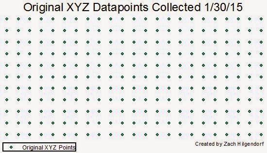
To begin this exercise, the elevation data acquired from the first portion of this exercise was imported into Esri ArcMap 10.2 (Figure 1).

Figure 1. The originally collected data after import into ArcMap. Each of those points has an XYZ designation.

A continuous surface needed to be created to compare the accuracy of our recording method to the actual terrain. The ability for comparison was achieved by interpolating the points using the Surface Analyst extension using a variety of different methods. Interpolation is the method of predicting the value of cells without data by comparing them with the cells around them and determining a value. There are number of different methods of interpolation available to us using ArcMap such as Inverse Distance Weighted (IDW), Kriging, Natural Neighbor, Spline, Spline with Barriers, Topo to Raster, Trend, and Triangulated Irregular Networks (TIN's). TIN's are not necessarily an interpolation method, as they draw triangles between nodes using Z-values, however they do help us to represent digital elevation models (DEM's). For the purpose of this exercise I will explain only the IDW, Kriging, Natural Neighbor, Spline, and Trend methods of interpolation. The various methods are defined below: 
  • Triangulated Irregular Network (TIN)
    • A method of vector-based surface modeling comprised of nodes, edges, and faces. Nodes are the points that connect to make the edges, while faces are the surface between three nodes. This method forms a series of triangles that vary in size and shape depending on the amount of points in an area (Figure 2). 
Figure 2. The map above is an example of a TIN surface model. Areas where no change in elevation exist appear as flat surfaces while areas with elevation change appear shadowed.
  • Inverse Weighted Distance (IDW)
    • A method of interpolation that estimates the value of a cell by averaging the values of neighboring data points. The closer a point is to the center of the estimating cell, the more influence the point has (Figure 3).
Figure 3. The map above is an example of an IDW surface model. This method estimates cell values by averaging neighboring data points. In this model the presence of circles symbolizes a need for more data points to smooth the terrain.
  • Kriging
    • A method of interpolation that estimates surfaces from a scattered set of z-values. It is suggested that for this method more than any other a thorough acquisition of datapoints be conducted to be able to provide the best spatial surface possible (Figure 4).
Figure 4. The map above is an example of a kriging surface model. This model requires a large collection of datapoints to ensure that the model is smooth. Our model did not necessarily have enough datapoints to create a smooth surface. The circular relics that remain in this model are evidence that not enough points were collected.
  • Natural Neighbor
    • A method of interpolation that finds the closest inputs and applies weight to them based upon proportionate values to interpolate a point (Figure 5).
Figure 5. The map above is an example of a natural neighbor surface model. This model provided a decent representation of our surface though a few relics from the interpolation process did exist, so this method was not chosen for the next step of the process.
  • Spline
    • A method of interpolation that estimates values based upon a mathematical function that minimizes overall surface curvature (Figure 6).
Figure 6. The map above is an example of a spline surface model. This model minimizes the overall curvature of the created surface. The spline model created the surface that most accurately resembled the terrain we created in the planter box. This method was chosen for further use after more points were collected to strengthen the accuracy of the model.
  • Trend
    • A method of interpolation that is supposed to fit a smooth surface defined by a mathematical polynomial function. This method is more designed to work with a coarser surface model.
Figure 7. The map above is an example of the trend surface model. As this model is more fit to deal with coarse surface data and generates a much smoother surface, this interpolation method is not necessarily fit to deal with our model. 

After all of the initial interpolation methods were researched and examined, it was determined that the Spline method gave us the model that most resembled our actual terrain. We then determined areas that could be improved and determined a number of areas that we wanted to resample and increase the amount of points taken (Figure 8).

Figure 8. The above map shows the original data that was collected for surface modelling in green, with the newly collected points displayed in red. The newly collected points were collected in areas that were determined as needing more detail.

The spline and TIN creation tools were used again to examine the interpolation of the terrain with the newly added data points (Figure 9 and Figure 10).

Figure 9. The map above shows what our TIN surface models looks like after more points were gathered to strengthen the detail in the model.

Figure 10. The above map shows the spline interpolation method after more points were collected to strengthen the model. An interesting change was noticed using the spline method. When the original points were interpolated using the spline method the results were smooth and did not show many relics of the interpolation method. When the resampled points were added to the model and reinterpolated many relics of the interpolation process remained.

Discussion
There were a number of issues I encountered when interpolating the newly sampled terrain surface. First off, when we began to sample the new surface the surface had to be cleared off and after a fresh layer of snow had fallen. We cannot say with any certainty whether or not there were significant changes to the terrain that would have altered our results. When I used the newly sampled data to interpolate new surfaces I came across more issues. The spline interpolation, which we selected in the first portion of this exercise because of how well it fit, did not fit well at all when using the new data. There were circular relics of the interpolation process over all of the resampled areas. After checking all the other methods I could not find a method that accurately resembled our terrain, other than the TIN method.

Conclusion
This exercise allowed us to continue developing our critical thinking skills. While we were not able to find a method that accurately and sufficiently resembled our terrain, we did learn a suite of techniques with which to improve our methods in the future. I found that this exercise was a very helpful in developing my methods of project planning. We had to truly think about our methods and develop something that would most accurately represent our model. We also had to learn about interpolation methods and determine which method would accurately represent our terrain. In the future, I feel that I will be able to structure my project more accordingly to the particular situation.

Works Cited
Comparing interpolation methods. Retrieved February 5, 2015, from http://resources.arcgis.com/en/help/main/10.2/index.html#//009z000000z4000000

What is a TIN surface? Retrieved February 6, 2015, from http://resources.arcgis.com/en/help/main/10.2/index.html#//006000000001000000