Sunday, February 15, 2015

Field Methods: Field Navigation Map Development

Development of a Field Navigation Map

Introduction
The ability to properly navigate while in the field is an essential skill in any geographers toolbox. Proper orienteering skills are easily learned and can prevent or help in serious situations if the person becomes lost in the woods. The first step to being able to properly orienteer is to ensure that a you have a map that provides clean and usable attributes. It is crucial, when creating these maps, to remember that functionality, not artistic capability, is key. A map can look pretty but have little functional capability, resulting in an even more severely lost person. 

Orienteering, which will be discussed in greater detail later in the semester, is the process of using a map and compass to maneuver over an area. We will be using orienteering to locate a number of markers along a property known as the Priory, owned by the University of Wisconsin-Eau Claire.

Study Area
The navigational map is being created for navigating a property owned by the University of Wisconsin-Eau Claire, known as the Priory. The Priory is within Eau Claire County, in the town of Washington, approximately three miles south of the University of Wisconsin-Eau Claire campus. The north edge of the Priory is bounded by the eastbound lane of Interstate 94, while the south edge is bounded by Priory Road (Figure 1). 

Figure 1. Map showing the location and layout of the Priory. 

Methods
Our first objective of this exercise was to better understand the size of our paces, which helped to provide a reference scale on the maps we would later create. To determine our average step size a straight 100 meter path was determined outside of Phillips Hall. This path was walk a few times to get an idea of our average step sizes. My average step size at my normal walking pace over 100 meters was determined to be roughly 60 paces per 100 meters. This data was placed on the left sidebar of my completed maps.

My initial data processing had me running a slope analysis tool to determine the slope of the Priory using LiDAR data acquired in 2013. This data then was reclassified into five intervals, as the nature of this exercise did not require the extreme precision of a LiDAR raster. This data was used as a backdrop for the navigational map.

Understanding the necessary steps and requirements for a usable field navigation map is essential to its creation. We were required to use both a Universal Transverse Mercator (UTM) and a Geographic Coordinate System (GCS) for our map. The UTM coordinate system divides the globe into 60 north and south zones, spanning six degrees on the globe each (ESRI, 2013). Looking at only six degrees in each zone allows for the projection to have some distortion towards the outer edges, but to maintain a good degree of accuracy near the inside. Wisconsin falls within UTM Zone 15N and UTM Zone 16N (Figure 2).

Figure 2. Map showing the Universal Transverse Mercator zones for the United States (Wikipedia, 2015). Wisconsin falls within UTM Zone 15N and 16N. Our study area falls within UTM Zone 15N.

To create the necessary grid for the North American Datum (NAD) 1983 UTM Zone 15N map, Layers was selected, then Grids, and New Grid. A Graticule Grid was selected for this grid, with the XY interval being set at 50 meters. To attempt to make this map appear less "busy" the first few numbers that begin to designated distance from the equator have been removed so the grid text did not dominate most of the view. (Figure 3).

Figure 3. Navigational Map showing the UTM Zone 15N grid.

A GCS is a three-dimensional, spherical surface used to define locations on the earth (ESRI, 2013). This surface is "tied down" to the earth's surface by the use of datum. A datum is a group of highly accurate survey points that act as "staples" to pin the surface to the earth down in the appropriate place (Hupy, 2013). In this case, the datum used is the World Geodetic Survey (WGS) 1984. WGS 1984 is used with Global Positioning Systems (GPS), as it represents a more international datum (Figure 4).

Figure 4. Map showing the layout of the WGS 1984 global coordinate survey. Major distortion is noticed along the top and bottom of the map, highly distorting northern Canada and Alaska, Northern Europe and Northern Russia, and Antarctica.
To create the necessary grid for the GCS WGS 1984 map, Layers was selected, then Grids, and New Grid. A Measured Grid was selected and the defaults were selected. In the Properties menu for the grid, Decimal Degrees was selected as the measurement and an interval of four degrees was selected for spacing. The display on the grid for this grid option was in Decimal Degrees, of course, and the grid spacing was significantly larger than the UTM grid (Figure 5).

Figure 5. Navigational Map showing the GCS WGS 1984 grid.

Discussion
The two created grids provided significantly different results. First off, the UTM map fit the data frame significantly better than GCS map did. The UTM map was more vertical and closer to a square, whereas the GCS map resulted in a significantly horizontally elongated map. This resulted in a smaller scaled map with the GCS map because the details in the map had to be zoomed out to be seen better. The GCS map was better where the grid spacing was concerned, however. The grid spacing in the decimal degrees map was in four second intervals, roughly 0.001111 decimal degrees. I liked the spacing that came with the GCS map. The UTM grid was significantly closer together in spacing, with an interval of 50 meters. The interval in the UTM map will allow for significantly easier measuring, however.

The slope analysis, I felt, provided the best idea of the Priory. The leaf-off image that was the alternative did not necessarily show anything other than an aerial image. As we are navigating, key attributes like slope would be able to help us orient ourselves in the field. The lack of imagery could prove to be an issue, though hopefully that will be negated due to the digitization that was also included in the final map. This digitization will hopefully be able to provided an idea of the location of human built objects, such as the buildings and roads in the vicinity.

Conclusion
A navigational map is an essential tool for anyone attempting to orienteer in the field. Many things need to be kept in mind when creating a map that they will be taking into the field. Different units of measurement need to be examined and their pros and cons decided before choosing which one may be best for the situation. Where applicable, a grid that uses UTM coordinates may be better than a GCS map because of how the UTM coordinates are tied down to the earth's surface. This provides a more accurate representation of the land around you and will help to ensure that your measurements are accurate. 

Works Cited
Hupy, C. M. (September 25, 2013). Spatial Referencing. Personal Collection of Dr. Christina Hupy, University of Wisconsin-Eau Claire, Eau Claire, WI.

Universal Transverse Mercator. Retrieved February 15, 2015 from http://resources.arcgis.com/en/help/main/10.1/index.html#//003r00000049000000

Universal Transverse Mercator coordinate system. Retrieved February 15, 2015 from http://en.wikipedia.org/wiki/Universal_Transverse_Mercator_coordinate_system

What are geographic coordinate systems? Retrieved February 15, 2015 from http://resources.arcgis.com/en/help/main/10.1/index.html#//003r00000006000000

World GCS WGS 1984 Projection Map. Retrieved February 15, 2015 from http://www.mapsopensource.com/images/world-gcs-wgs-1984-projection-map.gif

Sunday, February 8, 2015

Field Methods: Digital Elevation Surface Creation Part 2

Visualizing and Refining Our Terrain Survey

Introduction
In the first portion of this exercise, we determined suitable methods for surveying an artificially created terrain. We constructed and recorded our terrain in such a way that the room for error was inherently reduced. One person was in charge of interpreting the elevation of the terrain. If only one person and their one method was used the inherent error with multiple interpretations was drastically reduced. In this exercise we started by importing our elevation data and modelling it within ArcMap 10.2. Elevation data was interpolated using a number of interpolation methods, areas that needed improvement were identified, the terrain was resampled, and finally the terrain was redisplayed using the preferred interpolation method and the newly acquired points.

Methods
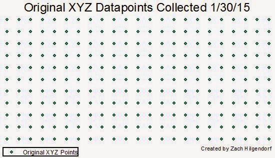
To begin this exercise, the elevation data acquired from the first portion of this exercise was imported into Esri ArcMap 10.2 (Figure 1).

Figure 1. The originally collected data after import into ArcMap. Each of those points has an XYZ designation.

A continuous surface needed to be created to compare the accuracy of our recording method to the actual terrain. The ability for comparison was achieved by interpolating the points using the Surface Analyst extension using a variety of different methods. Interpolation is the method of predicting the value of cells without data by comparing them with the cells around them and determining a value. There are number of different methods of interpolation available to us using ArcMap such as Inverse Distance Weighted (IDW), Kriging, Natural Neighbor, Spline, Spline with Barriers, Topo to Raster, Trend, and Triangulated Irregular Networks (TIN's). TIN's are not necessarily an interpolation method, as they draw triangles between nodes using Z-values, however they do help us to represent digital elevation models (DEM's). For the purpose of this exercise I will explain only the IDW, Kriging, Natural Neighbor, Spline, and Trend methods of interpolation. The various methods are defined below: 
  • Triangulated Irregular Network (TIN)
    • A method of vector-based surface modeling comprised of nodes, edges, and faces. Nodes are the points that connect to make the edges, while faces are the surface between three nodes. This method forms a series of triangles that vary in size and shape depending on the amount of points in an area (Figure 2). 
Figure 2. The map above is an example of a TIN surface model. Areas where no change in elevation exist appear as flat surfaces while areas with elevation change appear shadowed.
  • Inverse Weighted Distance (IDW)
    • A method of interpolation that estimates the value of a cell by averaging the values of neighboring data points. The closer a point is to the center of the estimating cell, the more influence the point has (Figure 3).
Figure 3. The map above is an example of an IDW surface model. This method estimates cell values by averaging neighboring data points. In this model the presence of circles symbolizes a need for more data points to smooth the terrain.
  • Kriging
    • A method of interpolation that estimates surfaces from a scattered set of z-values. It is suggested that for this method more than any other a thorough acquisition of datapoints be conducted to be able to provide the best spatial surface possible (Figure 4).
Figure 4. The map above is an example of a kriging surface model. This model requires a large collection of datapoints to ensure that the model is smooth. Our model did not necessarily have enough datapoints to create a smooth surface. The circular relics that remain in this model are evidence that not enough points were collected.
  • Natural Neighbor
    • A method of interpolation that finds the closest inputs and applies weight to them based upon proportionate values to interpolate a point (Figure 5).
Figure 5. The map above is an example of a natural neighbor surface model. This model provided a decent representation of our surface though a few relics from the interpolation process did exist, so this method was not chosen for the next step of the process.
  • Spline
    • A method of interpolation that estimates values based upon a mathematical function that minimizes overall surface curvature (Figure 6).
Figure 6. The map above is an example of a spline surface model. This model minimizes the overall curvature of the created surface. The spline model created the surface that most accurately resembled the terrain we created in the planter box. This method was chosen for further use after more points were collected to strengthen the accuracy of the model.
  • Trend
    • A method of interpolation that is supposed to fit a smooth surface defined by a mathematical polynomial function. This method is more designed to work with a coarser surface model.
Figure 7. The map above is an example of the trend surface model. As this model is more fit to deal with coarse surface data and generates a much smoother surface, this interpolation method is not necessarily fit to deal with our model. 

After all of the initial interpolation methods were researched and examined, it was determined that the Spline method gave us the model that most resembled our actual terrain. We then determined areas that could be improved and determined a number of areas that we wanted to resample and increase the amount of points taken (Figure 8).

Figure 8. The above map shows the original data that was collected for surface modelling in green, with the newly collected points displayed in red. The newly collected points were collected in areas that were determined as needing more detail.

The spline and TIN creation tools were used again to examine the interpolation of the terrain with the newly added data points (Figure 9 and Figure 10).

Figure 9. The map above shows what our TIN surface models looks like after more points were gathered to strengthen the detail in the model.

Figure 10. The above map shows the spline interpolation method after more points were collected to strengthen the model. An interesting change was noticed using the spline method. When the original points were interpolated using the spline method the results were smooth and did not show many relics of the interpolation method. When the resampled points were added to the model and reinterpolated many relics of the interpolation process remained.

Discussion
There were a number of issues I encountered when interpolating the newly sampled terrain surface. First off, when we began to sample the new surface the surface had to be cleared off and after a fresh layer of snow had fallen. We cannot say with any certainty whether or not there were significant changes to the terrain that would have altered our results. When I used the newly sampled data to interpolate new surfaces I came across more issues. The spline interpolation, which we selected in the first portion of this exercise because of how well it fit, did not fit well at all when using the new data. There were circular relics of the interpolation process over all of the resampled areas. After checking all the other methods I could not find a method that accurately resembled our terrain, other than the TIN method.

Conclusion
This exercise allowed us to continue developing our critical thinking skills. While we were not able to find a method that accurately and sufficiently resembled our terrain, we did learn a suite of techniques with which to improve our methods in the future. I found that this exercise was a very helpful in developing my methods of project planning. We had to truly think about our methods and develop something that would most accurately represent our model. We also had to learn about interpolation methods and determine which method would accurately represent our terrain. In the future, I feel that I will be able to structure my project more accordingly to the particular situation.

Works Cited
Comparing interpolation methods. Retrieved February 5, 2015, from http://resources.arcgis.com/en/help/main/10.2/index.html#//009z000000z4000000

What is a TIN surface? Retrieved February 6, 2015, from http://resources.arcgis.com/en/help/main/10.2/index.html#//006000000001000000

Saturday, January 31, 2015

Field Methods: Digital Elevation Surface Creation Part 1

Creation of a Digital Elevation Surface Using Critical Thinking Skills and Improvised Survey Techniques

Introduction
The purpose of this exercise was to better understand the necessary steps to survey a landscape and develop a terrain. We were given no directions to develop our terrain and no directions of how to record our results. Each group was given access to a supply of thumb tacks, yarn, and meter sticks. We were supposed to develop our terrain containing a ridge, hill, depression, valley, and plain. Finally, we needed to come up with a method to determine the elevation of the terrain we developed.

Our study was conducted using a planter box in the courtyard of Phillips Hall at the University of Wisconsin-Eau Claire on Friday, January 30, 2015. The medium used to sculpt our terrain was snow. The temperature was around -9° Celsius and conditions were overcast with winds out of the southwest at three miles per hour. The study was conducted between 11:00am-1:00pm. My group was composed of Galen Keily, Michael Bomber, and Kiernan Johnson, Jacob Henden,

Methods
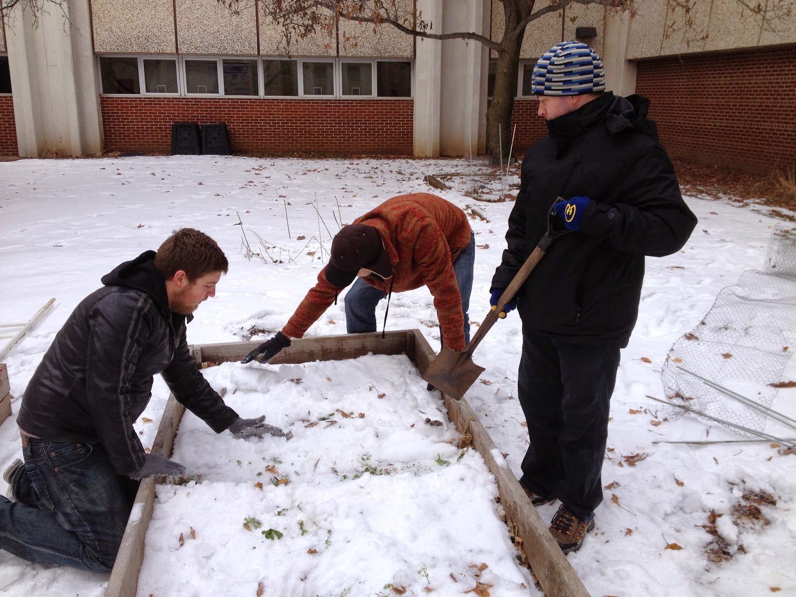
The first step was to develop our terrain. We first sketched out our terrain on a piece of paper and then used that plan to dig our terrain out within the planter box. Snow was added to the planter box, the ground was leveled, and the terrain we had sketched was sculpted into the landscape (Figures 1-3).

Figure 1. An action shot of our group sculpting the terrain we developed on paper (Photograph by Zach Hilgendorf). 

Figure 2. A side view from slightly above the planter box. The image helps to give some idea of the topography of the terrain (Photograph by Zach Hilgendorf).

Figure 3. A view from above the planter box shows the finished product. Each of the required landforms were included and are labeled in the picture (Photograph by Zach Hilgendorf).

The next step was to develop a way to obtain elevation samples from the terrain in a consistent and uniform manner. We measured in ten centimeter increments and developed X and Y axes which originated from the same point. The X axis ranged from 0-23 and the Y axis ranged from 0-11. The result was a grid pattern of yarn and meter sticks. We did not have enough yarn to complete the entire grid pattern so the top four positions were measured from the last position of the yarn, using the method of sampling we developed (Figure 4). Every one of the ten by ten centimeter cells were sampled and recorded. We tried to record samples from the middle of each of the cells to maintain consistency. In total, two hundred and fifty-three samples were taken from the grid.

Figure 4. The pins along the edges mark out ten centimeter increments along the perimeter of the planter box. The meter sticks that appear vertically in this photograph were used when we ran out of yarn. Our "zero" point, where both the X and Y axis originate from, is in the top right corner of this picture. In this photograph, the bottom portion of the box appears empty and does not appear to be gridded out. We ran out of yarn and had to use the meter sticks and the placement of the thumbtacks on the side to properly sample those portions (Photograph taken by Zach Hilgendorf).
The terrain was created in such a way that nothing was above the yarn we used to grid the planter box. This allowed for us to measure every point from the ground to where the yarn/meter stick crossed the stick we used to measure elevation with. Two very small portions were excluded from the grid. When the grid was created the cells in two edges were very small due to where the ten centimeter increments extended to. This meant that two edges, those opposite of our originating points, formed very small cells. We considered these cells to be negligible and no recordings were taken.

Results
All of the results are in negative numbers, as they measure the elevation from the top of our plane (the yarn/meter sticks) to the ground. The top of the plane is considered an elevation of zero centimeters (Figure 5).

Figure 5. The grid shows the raw elevation data for the terrain grid. The negative number in the orange background show the z-value from the string downward to the ground. 

Discussion
There are a number of small discrepancies that should be addressed that may slightly alter our results. As stated in the Methods section, two small sections were excluded. The small column and row that were excluded did not impact the rest of the grid and therefore were not necessary to represent the the terrain model we created. The method developed to measure elevation did have some inherent error. The plane that we measured elevation to, the level of the yarn/meter stick, was determined by the person measuring. This means there was some level of interpretation in the measuring of elevation. In order to minimize this error we did not change the person measuring our elevation. If we rotated this role there would most likely have been a significant change in interpretation. There was not much other room for error, as we made sure that the increments were accurate and all the numbers were accurately recorded. 

Conclusion
Our next step will to be export our raw data as actual elevation measurements into a GIS and model our terrain. If our methods proved valid then our digital terrain model should very closely resemble the terrain we sculpted in the planter box. Critical thinking and improvisation were very necessary skills that our group needed to have in order to complete the first part of this exercise. These concepts hold true in the field as well. We will not always have set methods and standards that we are given in an instruction manual. The development of critical reasoning and the ability to improvise methods to meet the current goals of the job are crucial to furthering one's understanding.